Xamarin.Forms is a great tool for cross platform app development. It gives you the ability to write shared code that is used by different operating systems. Not only are you able to write shared logic, but you are also able to write shared UI code. This allows you to save time in initial development and makes it much more maintainable since there is only one version of the code. Not only this, but Xamarin.Forms is able to use native elements of each platform so that you are still able to get a native look and feel for each device.
Although this shared code is fast and works well, it doesn’t always provide the granularity that we are looking to use for each platform. Sometimes a finer brush is needed to paint our masterpiece. This is no reason to fret, though. Xamarin.Forms allows us to create custom renderers so that we are able to extend controls to take advantage of native specific elements for each platform. In this blog post, we will create a couple of custom renderers in a Xamarin.Forms project to make elements that are more robust than what comes out of the box.
Create Xamarin.Forms Project
Let’s start by creating a new Xamarin.Forms project. I am developing on a Windows computer in Visual Studio 2019. You can do this just as well on Visual Studio for Mac. We are are going to write this app to run for both iOS and Android.
First, open Visual Studio, and create a new project. Select Mobile App (Xamarin.Forms), and click Next. Give your project a name, mine is called “CustomRendererSample,” choose a location, and create the project. Select a Blank template, and for platforms, we are doing Android and iOS. You can certainly do UWP as well, but we are only targeting iOS and Android in this example. Press OK, and our project is now created.
Toolbar Buttons
For this example, we are going to make an app with a hierarchical navigation scheme. This has the toolbar at the top, and pages are added to and popped off the stack as you navigate. We are only going to have one page for our example, though. With the toolbar at the top, it is common to have toolbar buttons. These can be save, cancel, back, refresh, and so on. You will find these in many of the first party phone apps (like Settings) or pretty much any native enterprise style app. Toolbar buttons can be created through Xamarin.Forms, but as an extension to the control, we are going to have the app use System toolbar buttons on iOS to get a totally native look.
First, let’s get the navigation page set up for the app. Open App.xaml.cs in the Shared Project of your Solution. Make the following edit to the constructor.
MainPage = new NavigationPage(new MainPage());This creates a NavigationPage as the root page of the app, and then adds MainPage as the content of the navigation page. Feel free to go ahead and run the app. You should now see a blank toolbar at the top of your screen, and the Xamarin.Forms welcome label displayed in the middle of it. We’re off to a good start!
Now, open MainPage.xaml. Start by deleting the entire StackLayout and the welcome label that is inside it. We are going to make our own content later.
<StackLayout>
    <!-- Place new controls here -->
    <Label Text="Welcome to Xamarin.Forms!"
      HorizontalOptions="Center"
      VerticalOptions="CenterAndExpand" />
</StackLayout>
Next, we’ll give the page a title to go on the toolbar. Set the title property on ContentPage to “Awesome Page.”
<ContentPage …… Title=“Awesome Page”>Android Toolbar Buttons
We don’t have to add images to our project for iOS since we are using system buttons, but we do need them for Android. We are able to download Android buttons without any problem from the material.io website. All Android icons are open source and are available to be used in any project. We are going to use the search icon in our project. Go to this page, select the “search” icon, and download the SVG 24 file.
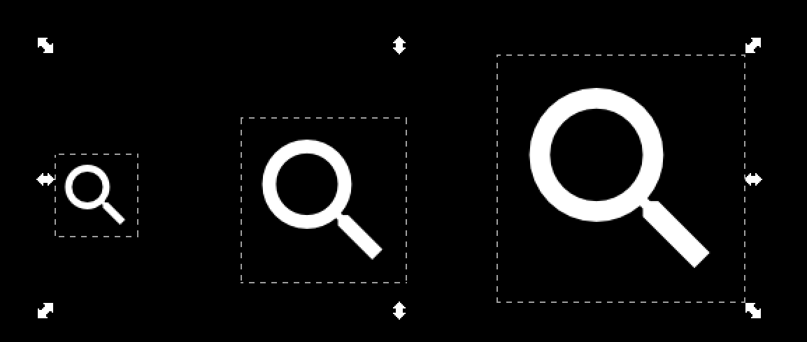
I like to open this file in Inkscape (use can use any vector drawing program to edit the file without losing image quality). The image, which is a little larger than 17×17, is designed to be centered on a transparent 24×24 background. Once you do that, we want to change the color of the icon to white, and create 3 different sizes—24×24, 48×48, and 72×72. Now, they are ready to export and add to our project. Please see the image below for what my icons look like.
Let’s go back to Visual Studio. Inside the Android project, open the Resource folder. Drag the 24×24, 48-48, and 72×72 icons into the drawable, drawable-hdpi, and drawable-xxhdpi folders, respectively. All three of my icons are named “searchIconDroid.png.” Now that the icons are created and added to the project, we can return to the code.
On a side note, these drawable folders are currently not working in the Microsoft version of Visual Studio. You can look through the File Explorer and see that the folders do not actually exist. To fix it, simply delete the fake folders that are currently shown, and re-add folders with the same names.
Create the Toolbar Item in XAML
Open MainPage.xaml again, and add the following code.
<ContentPage.ToolbarItems>
    <ToolbarItem x:Name="SearchButton"
      Text="Search">
        <ToolbarItem.IconImageSource>
            <OnPlatform x:TypeArguments="FileImageSource">
                <On Platform="iOS" Value=""/>
                <On Platform="Android" Value="searchIconDroid"/>
            </OnPlatform>
        </ToolbarItem.IconImageSource>
    </ToolbarItem>
</ContentPage.ToolbarItems>
This code creates a ToolbarItem named “SearchButton.” We aren’t going to reference the button in this project, but it can still be helpful to give a name to your elements. We set the “Text” to “Search.” This is what our iOS custom renderer is going to use to identify what kind of system bar button should be used. Finally, we set the IconImageSource. We use platform specific code where the Android version is set to the name of the search icon that we created, and the iOS version is left empty. You can run this code on an Android device and see our beautiful search icon, but the iOS version still needs a custom renderer.
iOS Toolbar Button Custom Renderer
It’s finally time to create our first custom renderer. Right click on the iOS Project in your Solution and select Add->New Item… Add a new class called CustomNavigationRenderer.cs. To set up the page, we have to add an assembly directive to the top. This line makes all instances of the Xamarin control referenced flow through this custom renderer. Add the following line (note: many of the lines will require additional using namespaces to be added. Visual Studio should show errors and tell you which namespaces need to be added).
[assembly: ExportRenderer(typeof(ContentPage), typeof(CustomNavigationRenderer))]You can see that this names ContentPage, which is the page type that we are using in the Shared Project, and the name of this renderer. Next, add that our new renderer class inherits from PageRenderer.
class CustomNavigationRenderer : PageRendererNow we add the logic to the page.
protected override void OnElementChanged(VisualElementChangedEventArgs e)
{
    base.OnElementChanged(e);
    CreateNativeToolbarItems();
}

private void CreateNativeToolbarItems()
{
    if (this.NavigationController == null)
        return;
    if (this.NavigationController.TopViewController == null)
        return;
    if (this.NavigationController.TopViewController.NavigationItem == null)
        return;
    if (this.NavigationController.TopViewController.NavigationItem.RightBarButtonItems == null)
        return;

    var rightList = new List<UIBarButtonItem>();
    foreach (var item in this.NavigationController.TopViewController.NavigationItem.RightBarButtonItems)
    {
        if (string.IsNullOrEmpty(item.Title))
        {
            continue;
        }
        if (item.Title.ToLower() == "search")
        {
            var newItem = new UIBarButtonItem(UIBarButtonSystemItem.Search)
            {
                Action = item.Action,
                Target = item.Target
            };
            rightList.Add(newItem);
        }
        else
        {
            rightList.Add(item);
        }
    }
    if (rightList.Count > 0)
    {
        this.NavigationController.TopViewController.NavigationItem.RightBarButtonItems = rightList.ToArray();
    }
}
We override the OnElementChanged method, which is defined in the parent class. This is called when the ContentPage is created or changed. We use this method to call our CreateNativeToolbarItems method. After checking that the NavigationController and toolbar pieces exist, we cycle through the toolbar buttons that have been created. If the title is set to “search,” which we did in the xaml code by setting the text property, we create a new UIBarButtonItem. This bar button is the system search icon and we put it into our RightBarButtonItems array instead of the button that was created by the XAML.
Run the project on iOS and you will find a system search icon nestled on the right side of the toolbar. Good job!
Toolbar Action
It’s not necessary, but we might as well have something happen when we press the toolbar button. Go back to MainPage.xaml, and add the following property to our ToolbarItem.
Clicked=“SearchButton_Clicked”We will also add a label to be manipulated when the button is pressed. Below the ToolbarItems code, add the following.
<ContentPage.Content>
    <Grid>
        <Label x:Name”SearchLabel” Text=“Search” VerticalOptions=“Center” HorizontalOptions=“Center”/>
    </Grid>
</ContentPage.Content>
Now, let’s go to the MainPage.xaml.cs file to define the click method. Add the following.
private void SearchButton_Clicked(object sender, EventArgs e)
{
    if (SearchLabel.TextColor == Color.Black)
    {
        SearchLabel.TextColor = Color.Green;
    }
    else
    {
        SearchLabel.TextColor = Color.Black;
    }
}
This code will change the color of the label on the middle of the screen each time you click the search icon. Run the code and watch it in action. The label changes to black, then green, then black again on subsequent clicks.
Conclusion
Great job! In this tutorial, we put a toolbar item on a page in Xamarin.Forms. For Android, we used icons from material.io, sized them properly, and added them to our project. For iOS, we used a custom renderer to display system icons in the project. Even though we are using Xamarin.Forms, we were able to display a completely native look on each device. Feel free to further extend our iOS custom renderer to have left side toolbar buttons, different colored toolbar buttons, or anything else you can think of. As always, thanks for reading the HangZone blog.