In part 2 of our custom renderer blog post, we will continue to look at uses for custom renderers in Xamarin.Forms. In part 1, we made a navigation page in Xamarin.Forms. The toolbar item on the page used an icon from material.io for the Android version and used a system icon for the iOS version. We were able to use the system icon thanks to a custom renderer. If you have not read it, you can find part 1 here. We will start this project where part 1 left off.
Extending an Element
Let’s continue with the same Xamarin.Forms solution, which I named CustomRendererSample. The next thing that we want to add is a gradient underneath the toolbar. A shadow can be added to the Android project by adding an elevation property definition under the Resources->layout->Toolbar.axml file. This is not what we’re after though. We are going to add a loud, slightly obnoxious gradient on both iOS and Android under the toolbar.
The Xamarin.Forms control that we want to use is the BoxView. Unfortunately, we only have the ability to give it a single uniform color. To add our desired functionality, we will subclass BoxView and add additional properties to our new control. Then, we will create custom renderers for iOS and Android that will tell the system how to use our new properties. Hopefully, it won’t be too hard.
Create our Custom BoxView
Let’s start by creating our new BoxView class. Right click on the Shared Project and select Add->New Item… Add a new class called GradientBoxView.cs. We could create our properties simply as public properties, but instead, we are going to use BindableProperty. This will allow us to set these properties in a style. Styles do not make much sense if you are only using them once, but they can be quite helpful for maintaining and updating your code if objects with the same appearance are used multiple times.
Add the following code to your GradientBoxView class.
public class GradientBoxView : BoxView
{
    public static readonly BindableProperty StartColorProperty = BindableProperty.Create("StartColor", typeof(Color), typeof(GradientBoxView), Color.Transparent);
    public static readonly BindableProperty EndColorProperty = BindableProperty.Create("EndColor", typeof(Color), typeof(GradientBoxView), Color.Transparent);
    public static readonly BindableProperty IsVerticalProperty = BindableProperty.Create("IsVertical", typeof(bool), typeof(GradientBoxView), true);

    public Color StartColor
    {
        get { return (Color)GetValue(StartColorProperty); }
        set { SetValue(StartColorProperty, value); }
    }

    public Color EndColor
    {
        get { return (Color)GetValue(EndColorProperty); }
        set { SetValue(EndColorProperty, value); }
    }

    public bool IsVertical
    {
        get { return (Color)GetValue(IsVerticalProperty); }
        set { SetValue(IsVerticalProperty, value); }
    }
}
You can see that the class inherits from BoxView, so that we retain all of the functionality of that class. Then, we added variables for StartColor, EndColor, and IsVertical. As the names suggest, these will define the starting color, ending color, and direction of the gradient.
Implementing the GradientBoxView
Now, let’s head over to App.xaml to create a style. Like we said, a style is nice in case we want to use the same gradient on a number of pages. In the Application.Resources section, add the following code.
<ResourceDictionary>
    <Style x:Key=“AwesomeGradientStyle” TargetType=“customrenderersample:GradientBoxView”>
        <Setter Property=“StartColor” Value=“DarkBlue”/>
        <Setter Property=“EndColor” Value=“#10FFFFFF”/>
        <Setter Property=“IsVertical” Value=“True”/>
        <Setter Property=“HeightRequest” Value=“10”/>
    </Style>
</ResourceDictionary>
As you can see, a style is added that sets all of our properties for the GradientBoxView. App.xaml will have to add “xmlns:customrendersample=“clr-namespace:CustomRendererSample” so that GradientBoxView will be imported into this class.
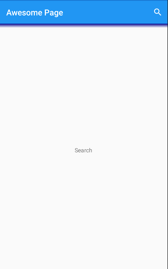
Now, we can jump over to MainPage.xaml to add GradientBoxView to the page. Change the ContentPage.Content to look like this.
<ContentPage.Content>
    <Grid>
        <Grid.RowDefinitions>
            <RowDefinition Height="auto"/>
            <RowDefinition Height="*"/>
        </Grid.RowDefinitions>
        <customrenderersample:GradientBoxView Style=“{StaticResource AwesomeGradientStyle}”/>
        <Label Grid.Row="1" x:Name="SearchLabel" Text="Search" VerticalOptions="Center" HorizontalOptions="Center"/>
    </Grid>
</ContentPage.Content>
You can see that we adjusted our grid to put the gradient underneath the toolbar at the top of the page, and our SearchLabel is still in the middle. Again, we need the same CustomRendererSample definition and prefix to use the class. That wraps up the code in our Shared Project. Let’s move on to our custom renderers and set our new GradientBoxView properties in motion.
iOS Custom Renderer
Let’s start with the iOS renderer. Its code is a little simpler, so it should be an easier place to begin. Navigate to the iOS project, right click and select Add->New Item… Choose a class and name it GradientBoxViewRenderer.cs. Click the Add button, and we’re ready to get started.
First, we need to add an assembly line so that this code will be used. Above the line that defines the namespace, add:
[assembly: ExportRenderer(typeof(GradientBoxView), typeof(GradientBoxViewRenderer))]This line tells our code to use this renderer whenever GradientBoxView occurs in the code. If you get errors in this code, or anywhere else in the custom renderers, you should be able to hover over the error and select for Visual Studio to add the appropriate using directive. Next, we will make this class a subclass of BoxRenderer.
class GradientBoxViewRenderer : BoxRendererTo add our gradient to the boxview, we only need to override one method, the Draw function.
public override void Draw(CGRect rect)
{
    base.Draw(rect);

    var stack = Element as GradientBoxView;
    var topColor = stack.StartColor.ToCGColor();
    var bottomColor = stack.EndColor.ToCGColor();
    var gradientLayer = new CAGradientLayer
    {
        Frame = rect,
        Colors = new CGColor[] { topColor, bottomColor }
    };

    if (!stack.IsVertical)
    {
        gradientLayer.StartPoint = new CGPoint(0, 0.5);
        gradientLayer.EndPoint = new CGPoint(1, 0.5);
    }

    NativeView.Layer.InsertSublayer(gradientLayer, 0);
}
Let’s walk through what is going on. First, we are getting our GradientBoxView and setting it to a local variable, stack. Next, we are getting the start color and end color from it, and converting the colors to CGColors. Then, we create a CAGradientLayer to the size of our BoxView with the gradient colors. Finally, we adjust the direction if horizontal is desired, and we add the gradient to the native iOS BoxView. That’s it! It is fairly straightforward, and just like that, the iOS version is good to go. Now, let’s move to Android.
Android Custom Renderer
This custom renderer is a little more involved, but we can do it. Go to the Android project in the Solution Explorer, and add a new class just like we did for the iOS renderer. We will also name this class GrandientBoxViewRenderer.cs. Add the same assembly directive above the namespace definition so that this renderer will be used for all GradientBoxViews when running on Android. Then, add the code so that this class will be a subclass of BoxRenderer. That’s where the same code ends.
First, we’ll add instance variables for our GradientBoxView properties at the top of the renderer class definition and an empty initializer for the class.
public class GradientBoxViewRenderer : BoxRenderer
{
    private Color StartColor { get; set; }
    private Color EndColor { get; set; }
    private bool IsVertical { get; set; }

    public GradientBoxViewRenderer(Context context) : base(context)
    {

    }
}
Then, we will override OnElementChanged. We will use this to set the values of our instance variables.
protected override void OnElementChanged(ElementChangedEventArgs<BoxView> e)
{
    base.OnElementChanged(e);

    if (e.OldElement != null || Element == null)
    {
        return;
    }

    try
    {
        var stack = e.NewElement as GradientBoxView;

        this.StartColor = stack.StartColor;
        this.EndColor = stack.EndColor;
        this.IsVertical = stack.IsVertical;
    }
    catch (Exception ex)
    {
        System.Diagnostics.Debug.WriteLine(@"ERROR:", ex.Message);
    }
}
Now that we have our variables from GradientBoxView, it’s time to do our drawing code to create the gradient on the Android BoxView.
protected override void DispatchDraw(global::Android.Graphics.Canvas canvas)
{
    if (global::Android.OS.Build.VERSION.SdkInt > global::Android.OS.BuildVersionCodes.O)
    {
        var orientation = GradientDrawable.Orientation.TopBottom;

        if (!this.IsVertical)
        {
            orientation = GradientDrawable.Orientation.LeftRight;
        }

        var specialGradient = new GradientDrawable(orientation, new[] { this.StartColor.ToAndroid().ToArgb(), this.EndColor.ToAndroid().ToArgb() });
        ViewCompat.SetBackground(this, specialGradient);
        return;
    }

    global::Android.Graphics.LinearGradient gradient = null;

    if (this.IsVertical)
    {
        gradient = new global::Android.Graphics.LinearGradient(0, 0, 0, Height, this.StartColor.ToAndroid(),this.EndColor.ToAndroid(), global::Android.Graphics.Shader.TileMode.Clamp);
    }
    else
    {
        gradient = new global::Android.Graphics.LinearGradient(0, 0, Width, 0, this.StartColor.ToAndroid(), this.EndColor.ToAndroid(), global::Android.Graphics.Shader.TileMode.Clamp);
    }

    var paint = new global::Android.Graphics.Paint()
    {
        Dither = true,
    };
    paint.SetShader(gradient);
    canvas.DrawPaint(paint);
    base.DispatchDraw(canvas);
}
As you can see, the technique is different for Android versions greater than O. For the newer versions, we simply get our orientation, then create a GradientDrawable with our colors. Then, we set it as the background on the native ViewCompat. For the older Android versions, we create a LinearGradient based on the gradient direction. Then, we DrawPaint the gradient onto the canvas. That’s it for Android and our GradientBoxView. Run the project and see your custom GradientBoxView in action! You can easily change the color, direction, or size if you so desire.
Conclusion
Great job! We successfully created a custom control in Xamarin.Forms—a GradientBoxView. This is a nice tool for adding gradients under objects in your projects to further set them off or provide separation of sections. Not only that, but you should now have a good idea of how to create other custom controls using custom renderers. It’s not always simple, but you can usually use custom renderers to accomplish any visual look or action that would natively be available on the platform. As always, thanks for reading the HangZone blog!