We usually write about iOS and Android on the HangZone blog, but legend has it that there are some mobile devices out in the wild that run Windows. These unicorns of the mobile world run Universal Windows Platform (UWP) apps, which you can build natively with XAML and C#.
If this seems like an awfully small market to target, keep in mind that UWP apps cover Windows 10 desktop as well. You can also use XAML and C# in Xamarin—another Microsoft product—to deploy to iOS and Android, as well as UWP. It seems XAML and C# actually have every market covered!
With that introduction out of the way, it’s time to fill up a XAML rectangle with more than one color!
The Rationale Behind Filling a Rectangle with Multiple Colors
Let’s say you need a rectangle that is one third red, one third yellow, and one third blue. Without any other constraints, this is pretty straightforward. You can just put three individual rectangles next to each other in a stack panel with no margin in between them, and you’ve got your tricolored rectangle.
<StackPanel Orientation: “Horizontal”>
    <Rectangle Fill=“Red” />
    <Rectangle Fill=“Yellow” />
    <Rectangle Fill=“Blue” />
</StackPanel>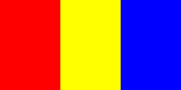
That’s all good and well, but imagine if you’re constrained within the confines of an existing rectangle. Perhaps you need to color the background rectangle of a table cell. You could have a table of workers with their names in one column and their progress towards their respective monthly sales goals in a second column, expressed as a percentage. Wouldn’t it be nice to style the percentage cells with a bicolor background? If the cell says 60%, we’d like the left 60% of the background to be blue with the remainder in red. This will require a more intricate solution.
An Unlikely Use of Gradients
When I think of gradients, I think of the goofy background on the Instagram logo. We transition for purple to red to yellow and every shade in between. That’s not what we want to do here. We want a hard transition from blue to red without the intermediate colors. Bear with me for a moment though. This will get us where we want to go.
Let’s make a single rectangle and use the LinearGradientBush property to create a blue-to-red gradient.
<Rectangle>
    <Rectangle.Fill>
        <LinearGradientBrush StartPoint=“0,0” Endpoint “1,0”>
            <GradientStop Color=“Blue” Offset=“0.0” />
            <GradientStop Color=“Red” Offset=“1.0” />
        </LinearGradientBrush>
    </Rectangle.Fill>
</Rectangle>
This gives us a gradient as expected. But what if we made our gradient a little less gradienty?
Adding More Stops to the Gradient
The LinearGradientBrush creates gradient transitions between each of the individual GradientStops. If two consecutive stops are the same color, there won’t be any transitional change in color!
We want the blue to extend 60% of the way across the rectangle, so let’s add a blue stop at offset 0.6. We want an abrupt shift to red at this point, so let’s a red stop at offset 0.6 as well. The code should look like this.
<Rectangle>
    <Rectangle.Fill>
        <LinearGradientBrush StartPoint=“0,0” Endpoint “1,0”>
            <GradientStop Color=“Blue” Offset=“0.0” />
            <GradientStop Color=“Blue” Offset=“0.6” />
            <GradientStop Color=“Red” Offset=“0.6” />
            <GradientStop Color=“Red” Offset=“1.0” />
        </LinearGradientBrush>
    </Rectangle.Fill>
</Rectangle>
Just like that, the gradient effect is gone! All we see is a solid blue portion for the first 60%, followed by a solid 40% of red.
Binding the Color to Actual Data
While this technique works, we still have numbers hard-coded into the XAML. If we want to use this code to stylize cells’ backgrounds based on their values, we’ll have to do some data binding. Moreover, there’s no built in way to convert percentages to a series of GradientStops, so we’re going to have to write a converter.
Create a new C# class and call it PercentageToFillConverter. This class will handle binding, so we need to implement the IValueConverter interface. This amounts to defining two functions: Convert and ConvertBack. We don’t need ConvertBack for the purposes of this tutorial, so I’ll disregard it for now.
Here’s the code, followed by an explanation.
public class PercentageToFillConverter : IValueConverter
{
    public object Convert(object value, Type targetType, object parameter, string language)
    {
        try
        {
            double percentage = (double)value;

            LinearGradientBrush gradient = new LinearGradientBrush();
            gradient.StartPoint = new Windows.Foundation.Point(0,0);
            gradient.EndPoint = new Windows.Foundation.Point(1,0);

            GradientStop stop1 = new GradientStop();
            stop1.color = Colors.Blue;
            stop1.offset = 0.0;
            gradient.GradientStops.Add(stop1);

            GradientStop stop2 = new GradientStop();
            stop2.color = Colors.Blue;
            stop2.offset = percentage;
            gradient.GradientStops.Add(stop2);

            GradientStop stop3 = new GradientStop();
            stop3.color = Colors.Red;
            stop3.offset = percentage;
            gradient.GradientStops.Add(stop3);

            GradientStop stop4 = new GradientStop();
            stop4.color = Colors.Red;
            stop4.offset = 1.0;
            gradient.GradientStops.Add(stop4);
            return gradient;
        }
        Catch
        {
            Debug.WriteLine(“value not a percentage”);
        }
    }

    public object ConvertBack(object value, Type targetType, object parameter, string language)
    {
        throw new NotImplementedException();
    }
}
We start by grabbing the percentage value and casting it as a double. Then we create the LinearGradientBrush just as before, only this time the code is in C#. Similarly, we add the four GradientStops, with the offset of the middle two equaling the percentage variable.
That does it for the value converter! Now we just have to call it from XAML. At the top of our XAML, add the converter to the page resources.
<Page.Resources>
    <PercentageToFillConverter x:key=“percentageToFillConverter” />
</Page.Resources>
Finally, we can reduce our Rectangle code the the following.
<Rectangle Fill=“{x:Bind Percentage, Converter={StaticResource percentageToFillConverter}} />That’s it! Note that I’m assuming this Rectangle is inside a DataTemplate for some DataType that has a property called Percentage.
Final Thoughts
I know this is a pretty specific scenario for our first UWP tutorial, but it came up in a project recently, so I thought it might help some people. If you need to bind a more complex color pattern, remember that you can pass an array to the value converter as well. We’ll likely do more UWP tutorials in the future, so make sure to stay tuned! Until then, go make a nice app for the Windows phone users. They could use some attention!